The Problem
There were several issues with the BeSafe website redesign.
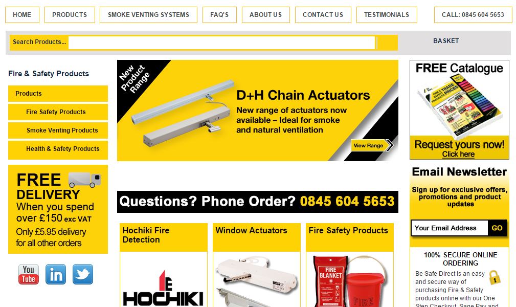
- The original branding colours were overwhelming for customers and needing toning down.
- The site was very cluttered and didn’t have a clear user journey, which often confused the user leading to a high bounce rate.
- The checkout system was broken which was losing be safe direct many customers
- The site was not mobile accessible meaning they were losing out on all visitors from mobile and tablet users.
All these factors combined to result in an underwhelming volume of conversions. Be safe wanted a fresh design to maximise the sales potential of the site and increase the volume of leads and sales.
Home page before redesign
The Solution
We worked closely with Be Safe Direct, looking into the current user experience, website data and statistics and honing in where the main ‘leaks’ of the current site were and how we could amend this. We focussed on the user journey, constructing a customer focussed plan of action to maximise the potential of the website.
- Gather the branding requirements for the site, colour schemes and new logos
- Analyse the current site data, trends and traffic identifying important factors for conversion
- Creating well thought out designs starting from mobile first, based on UX, best practice and analytics insights
- Seamless transition between new site and old site, implementing the necessary 404s to retain search engine value
- Tested the site vigorously across all devices
The Results
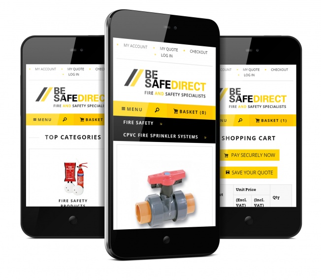
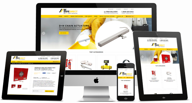
View the website here: www.besafedirect.co.uk
ExtraDigital produced an extremely eye catching design, whilst maintaining the existing branding and colour scheme.
Some statistics below:
- Average monthly increase of around 35% in total revenue when compared to previous year with the old website
- Average monthly search increase of around 30% of traffic year on year
- 42% increase in total transactions when comparing to previous year
