The Brief
Farm Marketplace is the UK’s leading online marketplace for farm supplies. Suppliers and farmers come to the website to buy and sell everything from veterinary livestock medicine to crop inputs and tractor parts.
ExtraDigital were recruited for our CS-Cart expertise. The client wanted help with redesigning the site to making it more user friendly.
Our Work
When ExtraDigital were recruited, the client had already started work on their new theme update. They required help from a CS-Cart specialist to help complete the template set up on the development website.
User-Friendly Design
There are a few key design elements that should always be considered on eCommerce sites. These will change depending on the type of page you are looking at – homepage, category, or product pages. In general, your website design should easily show what the product or service is, why to buy from you, and how.
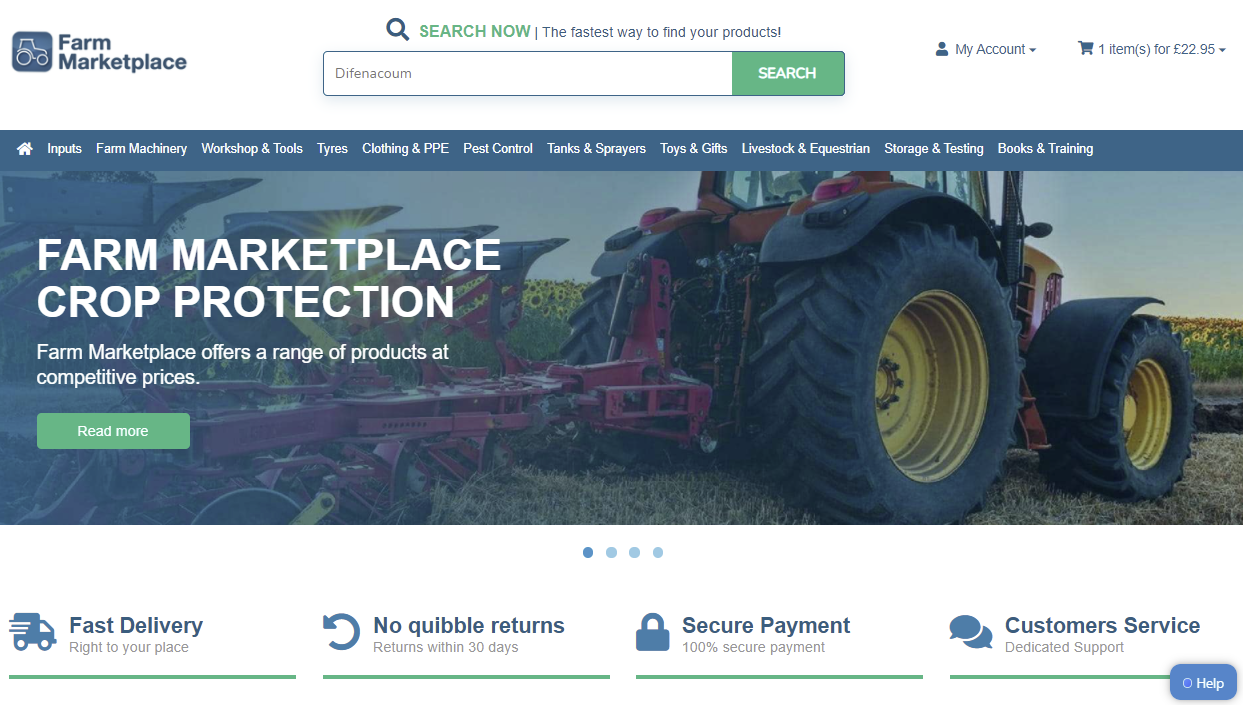
We implemented this by making the selling points clear immediately – reducing any doubts the customer might have. For Farm Marketplace, these were ‘Fast UK Delivery, Easy Returns, Secure Payments, and Dedicated Customer Support.’
We also have a sliding banner that shows the different products that you can find on the website.
The real beast to tame for this project was the drop-down menu customisation. As you can imagine, there are 100’s of categories of farming supplies to sell. We researched to organise these to make sense to the products, and it was still user-friendly to search through. We also redesigned the search function at the top of the website to match the new design.
These three components were all implemented above the fold on the homepage to immediately show what the product is, why you should trust Farm Marketplace and the benefit of buying from them and search functions that enhanced the site’s usability.
While most of the main changes were to the homepage and search functions, we updated product and category pages to have a cohesive design across the site.
Improvement to user engagement after the new skin went live
In the first two weeks that the skin went life, we saw:
- 15% increase in page/session
- -3% drop in the bounce rate
- 30% increase in page views
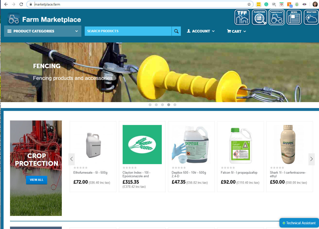
Before
After
Going Forward:
While we were working on the new design for the website, we were consulting the client on best practices for the long term. When the site went live, we were asked to continue marketing work on a new retainer. Going forward, we will be doing SEO, PPC, and Paid Social Marketing. We’re excited to send some customers to the shiny new site and bring great results for the client.
