For B2B lead generation, landing page design and copy are hugely important. Get this right, and your campaign will improve exponentially.
The best landing pages for B2B campaigns differ a little from B2C campaigns as the decision and buying behaviour is a bit different. Within B2B, the decision process is more reasoned, and evidence is often needed to support a purchase.
So here are some top tips for the very best B2B landing pages:
Write a specific landing page for every unique campaign message
An Inbound marketing campaign will include ads for all stages of the buyer process – and each of these will require a different landing page. The initial awareness stage may have multiple ads with different messages, and this will work best with a tailored landing page for each.
A question we are often asked is “Isn’t that a lot of landing pages?” Yes. And for good reason; it works best!
Ditch the Distractions
The best landing pages use a different template from your website pages. You do not need all the “clobber” and menus that are found at the top of a website.
The top navigation is a distraction – remove it! This prevents visitors from wandering off to other pages instead of reading your carefully written content.
You’ve Arrived Safely at the Right Place
The best B2B landing pages let the visitors know immediately they have arrived at the right place by using an obvious title or headline and a clear sub-heading.
A clear title serves to show that this is a useful page and matches what the visitor was expecting to see from the advert they clicked on.
First Impressions count
Visually, you have less than 1 second to make an impact – to convey the brand image. This is more than just the logo; it’s also the brand “message”. Is the company professional; innovative; cheap; reliable? Different industries will have different requirements here, but your landing page “feel” must match your company brand.
The top section of the landing page, often called the “hero section”, is the area to focus most on as this is what is seen initially, and where first impressions are formed.
It can include an image, provided the text is clear. Most effective B2B landing pages do have images here, but many work just as well with contrasting block colour and text.
Benefits first
The first real copy on the page should highlight the product benefits. Not the features.
And this is where B2B and B2C vary. For B2B landing pages, it is best to write down in copy, clearly for the reader to see, the product benefits. Why? Well, this helps them justify the product – it is part of the B2B buying process.
So where do the product “features” go? Either on another page, if this is an awareness landing page, or right at the bottom of the landing page after several calls to action if this is the decision phase.
Multiple CTAs work best
Most B2B landing pages work best with multiple CTAs. You should have one near the top, just after reading the first part of the copy, for those who want the information you are providing quickly. This should be clear and the primary visual focus of the page.
Add a second CTA lower down for those who need more persuading, or who like to read more first. And maybe other(s) still lower down after more detailed information.
Forms – Less is more
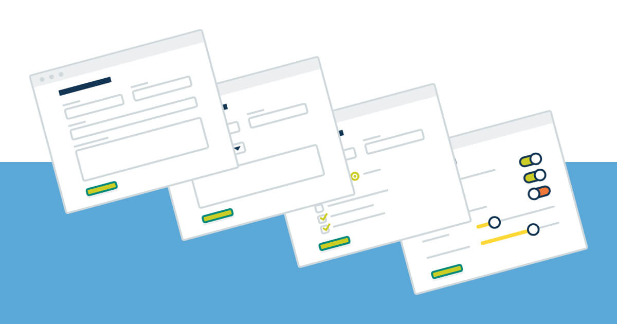
You need a form to gather data, but the visitor does not want to fill in a form. The best forms are as short as possible, and if using marketing automation, then smart forms that don’t repeatedly ask the same person the same information are best.
The first way to improve a form is to remove as many not-needed fields as possible. Then try and remove a few more. But next take a good look at the layout. Can this be improved to make the form “look” simpler? Form design is important and has a huge impact on conversion rates.
Don’t forget the trust factors
These are important for increasing conversion rates as they give reassurance. Accreditations, testimonials or 3rd party review ratings are most effective but not too many of them, as they will then take up too much space. Just enough to show reassurance.
Keyword-rich content
It is often useful to have a second section of copy lower down the page. This is great for giving more detail to those people who like to read more before enquiring.
It also helps get essential keywords onto the page when running an AdWords campaign, which makes the AdWords campaign work better – at a lower cost. You don’t want to be adding too many keywords into the first section of copy on the landing page.
Test, Improve and Re-iterate
Whenever you create landing pages, take the opportunity to try variations; of the header, of the hero image, of button colour or text. Try different copy. And keep iterating, gradually improving. Staggeringly significant improvements are possible by continuously optimising a landing page.
If your B2B Lead Generation results from PPC are lacking, try implementing a few of these great tips. Alternatively, you could speak to one of our experienced PPC Consultants who can help identify the issues that might be negatively influencing conversion.
