Graphic designers today have the challenge of creating visuals transitioning between print and digital formats. While the main design principles stay the same, each medium has unique requirements and opportunities.
Knowledge of print and digital design is crucial for creating marketing materials that engage audiences wherever they come across them. In this article, we’ll dive into important considerations for each format and share tips on adapting your design skills to perform better in print and digital.
Understanding Print Design
Print involves creating physically printed designs, including brochures, business cards, posters, large-scale backdrops, and more. Key points to consider for print design would include:
- Resolution: High resolution is a must. Always aim for 300 DPI (dots per inch) to ensure crisp, clear images in your final print.
- Colour Mode: Use CMYK colour mode, which is the standard for printing. Mixing different proportions of cyan, magenta, yellow, and black can give a wide enough range of colours that can give better, more accurate results.
- Typography: Fonts should be legible at various sizes. Print allows for more experimentation with textures and finishes.
- Bleed and Margins: Make sure designs extend beyond the edges (bleed) to avoid white borders and keep your design elements within safe margins during the printing process.
Below is an example of our designs for IRIS’s impressive exhibition at HITEC Toronto. The exhibition showcased their innovative F&B online ordering and mobile concierge platform. It included a large-format backdrop, a speaker stand, brochures, and selfie boards.

Digital Design
Digital design covers various graphics, such as websites, social media, emails, and online ads. Important aspects of digital design include:
- Resolution: Lower resolution is acceptable, typically 72 DPI, as screens do not require as high a resolution as print
- Colour Mode: Use RGB (Red, Green, Blue) colour mode, which is best suited for screens.
- Interactive: Digital designs can incorporate interactive elements like buttons, links, and animations.
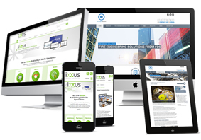
- Responsive Design: Ensure designs look good on various screen sizes, from desktops to mobile devices.

Adapting Your Skills
Adapting your skills for print and digital media involves understanding the strengths and limitations of each. Here are some tips:
- Stay Updated: Follow trends in print and digital design. Each format changes, and staying informed helps you create effective designs that are up-to-date and trending.
- Know Your Audience: Consider where your audience will see your design. Tailor your approach to the medium’s strengths and the audience’s preferences.
- Consistency is Key: maintain a strong brand identity across print and digital formats using the same colour palette, fonts, and imagery style.
- Use the Right Tools: Get familiar with design software that excels in print and digital design. Adobe Creative Suite, for example, offers tools for both.
- Experiment and Adapt: Don’t be afraid to experiment with new techniques and ideas. Each project is an opportunity to learn and enhance your skills.
Conclusion
Being able to design for both print and digital is a valuable skill. By understanding the variations of each medium and adapting your approach accordingly, you can create compelling designs that resonate with your audience, no matter where they encounter your work. Take on the challenge and let your creativity shine across all platforms.


