 A key principle of promoting your business or organisation online is to have a website that communicates effectively to your target audience. Traditionally this has included logical navigation, pages with great informative content supporting conversions plus key calls to action strategically placed.
These principles haven’t changed but the landscape they work in has. Technology has moved on and you can no longer be confident that your visitors are seeing your site the way you want.
Why?
The truth is many people now choose to access the web via mobiles and tablets, these have much smaller screens and make use of a lot of touch screen technology. Website designs that sit comfortable on a laptop can suddenly feel clunky and confusing on these smaller screens.
Navigation can be a particular issue and if a visitor can’t get around your site easily they are unlikely to convert into a lead or sale.
Why consider Mobile and Tablet Users?
It’s a common misconception that current traffic coming to websites from smaller mobile devices like phones and tablets in still very small, this really isn’t the case.
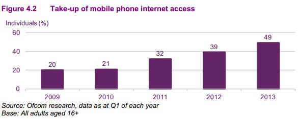
More people globally now own a mobile phone than a laptop, according to Ofcom in 2013, more than half of all UK adults owned a smart-phone while 24% of the population owned a tablet and these figures are increasing.

Worth the investment
Studies of mobile and tablet users are reporting great conversion rates last year Ofcom and econsultancy.com highlighted the following results:
- A fifth of mobile Internet users have bought goods or services from their phone.
- 69% of tablet owners make a purchase on their device every month
- 24% of UK consumers used mobile for Christmas shopping
- 32% of smart-phone owners use mobile to research products every week
- 25% of UK consumers have made a purchase using their mobile
These figures are set to rise as people become more comfortable with smaller mobile technology.
Changing to a Responsive Design
 If you have had your website design for several years then 2014 is a good year to look to the future and consider a fresh responsive web design. All ExtraDigital sites are now built to be responsive as well as Internet marketing friendly so you can be confident that you will get a site that supports your business both today and into the future.
Perhaps you’re not ready for a redesign just yet can you still go responsive?
Yes you can, most sites can be converted to a responsive design and still retain the same look and feel. At ExtraDigital we have already been working with several clients to update their existing sites to responsive design with very positive results.
Contact or call us today for a tailored responsive assessment on +44(0)1227 68 68 98.


